About Arcus / Your Presenter
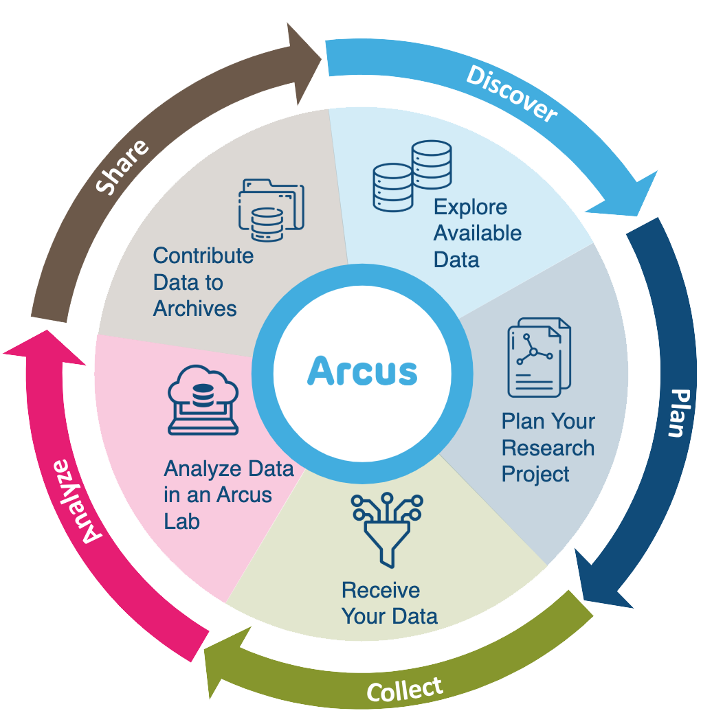
Arcus is an initiative by the Research Institute aimed at promoting data discovery and reuse and increasing research reproducibility.
- Arcus app: https://arcus.chop.edu
- Arcus Sharepoint site: https://chop365.sharepoint.com/sites/Arcus
Among the many teams in Arcus, I represent Arcus Education!
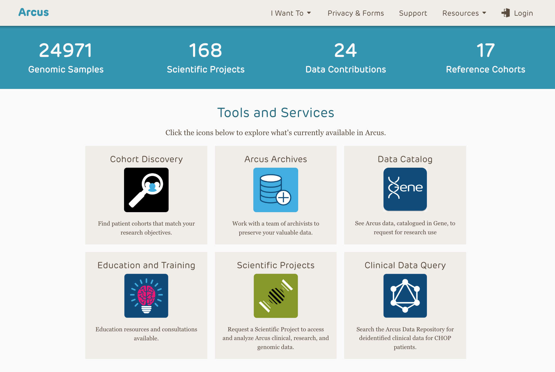
Arcus Education
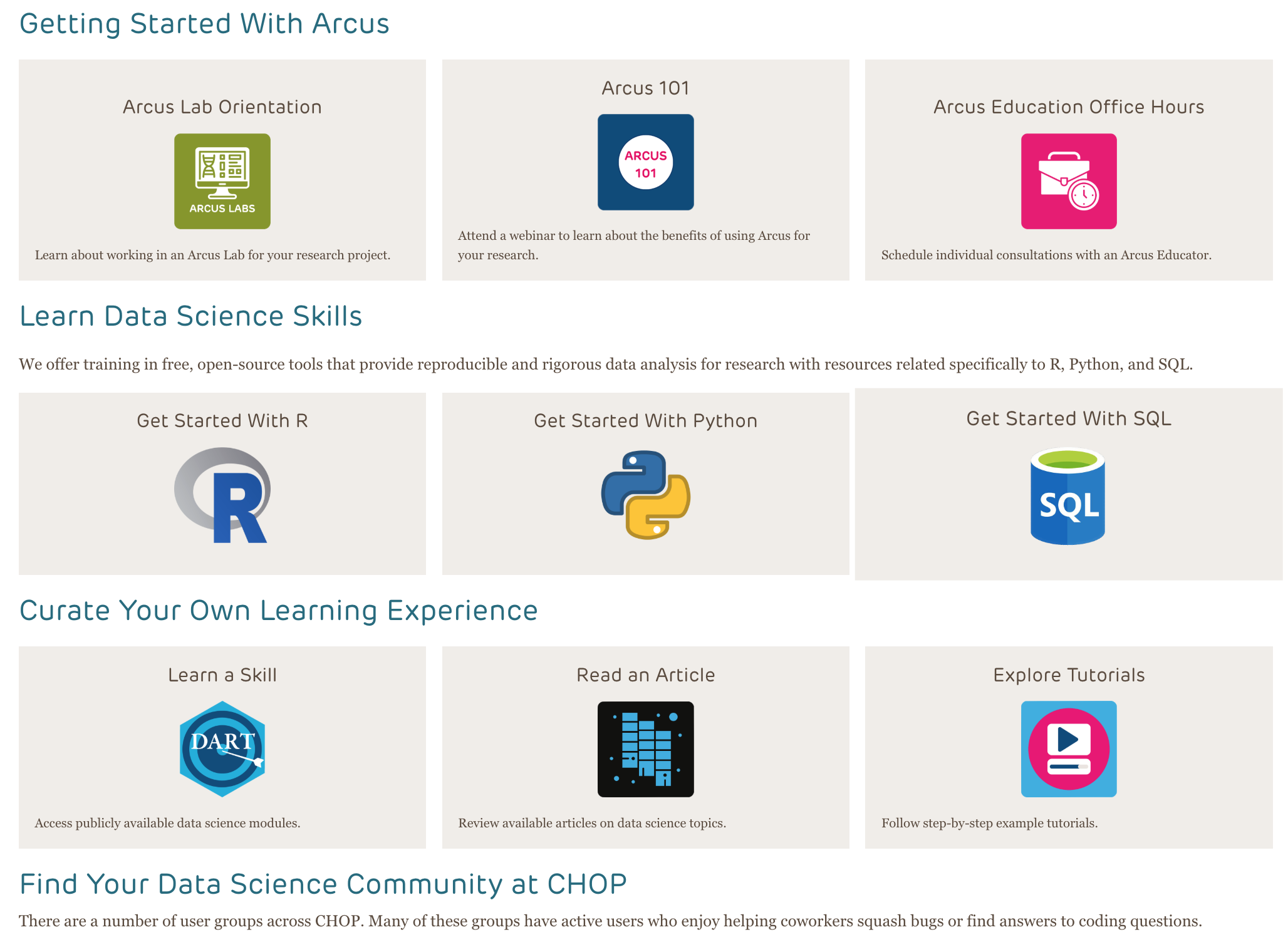
Arcus education provides data science training to researchers …
(and often this is useful to non-researchers too!).
https://arcus.chop.edu/i-want-to/arcus-education
Email us! arcus-education@chop.edu
ggplot2
 {fig-alt=“ggplot2 logo.”}
Step 2: Pick a “geom” function
There are lots of ways to depict data geometrically:
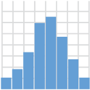
geom_histogram()
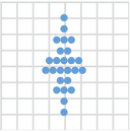
geom_dotplot()
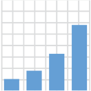
geom_bar()

geom_boxplot()
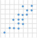
geom_point()
geom_line()
Step 3: Aesthetic Mappings
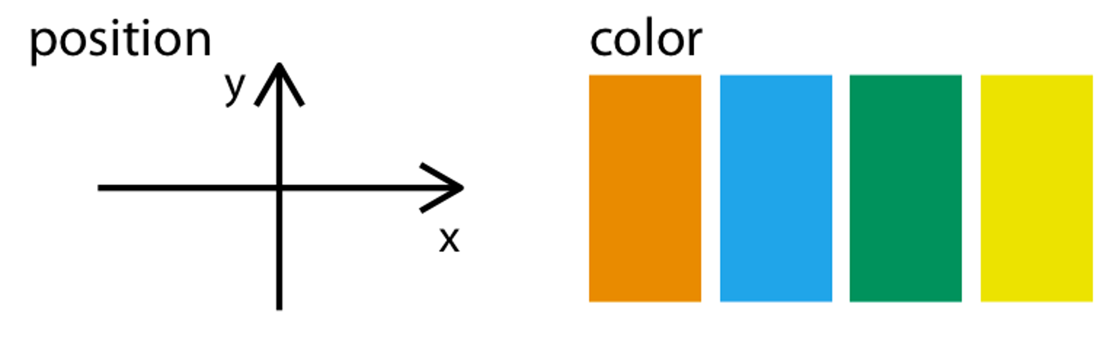
Aesthetic mappings connect columns to visible attributes.
Participation Time!
In addition to x/y position and color, what other aesthetic mappings can you think of?
(Hint: things that don’t change when the data changes, like the background color of a graph or the font or title of a graph, aren’t mappings).
Type your answers in the chat!
Next Session
Selecting Data Using dplyr
- Selecting columns
- Filtering rows
- Creating new columns
![]()